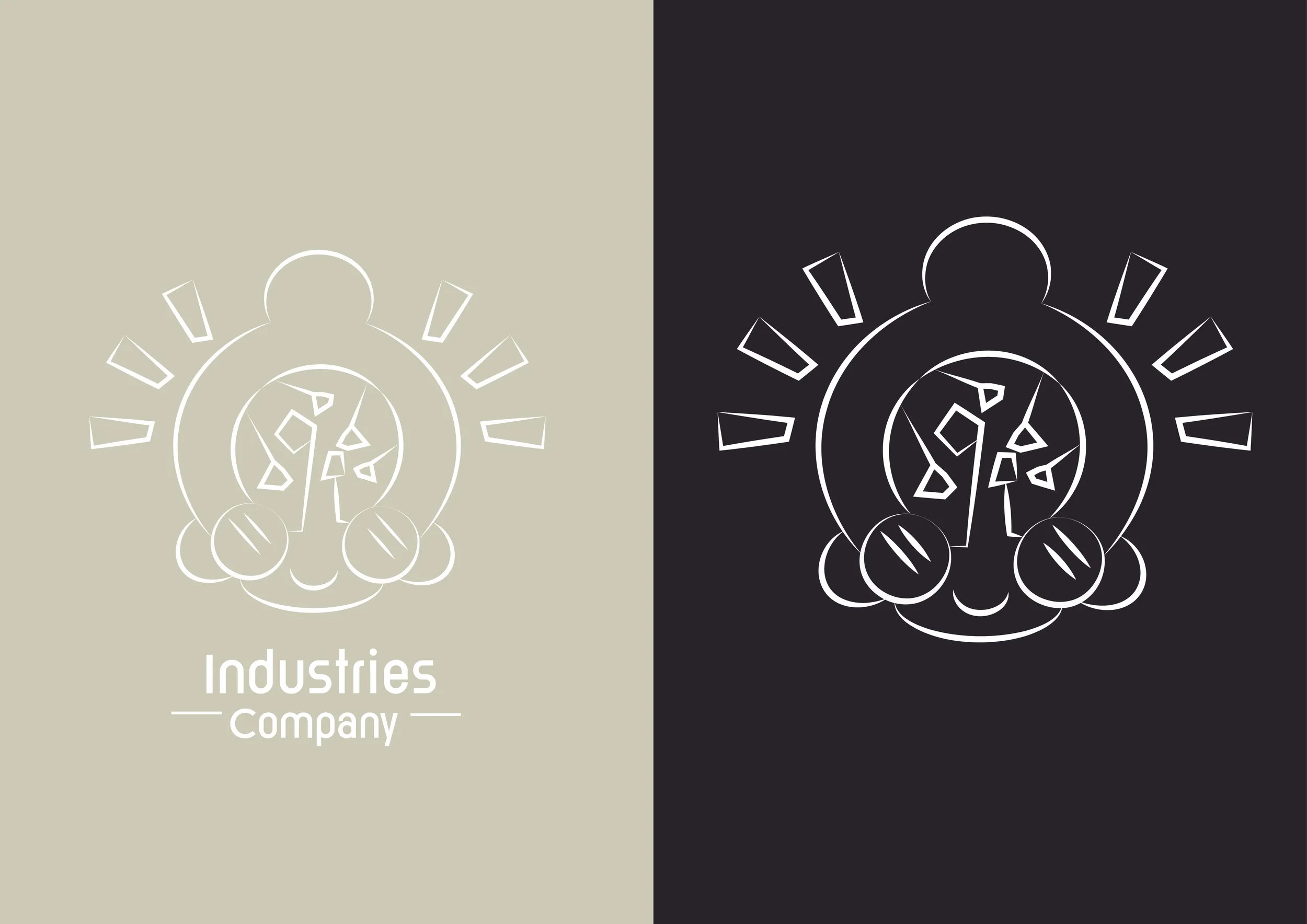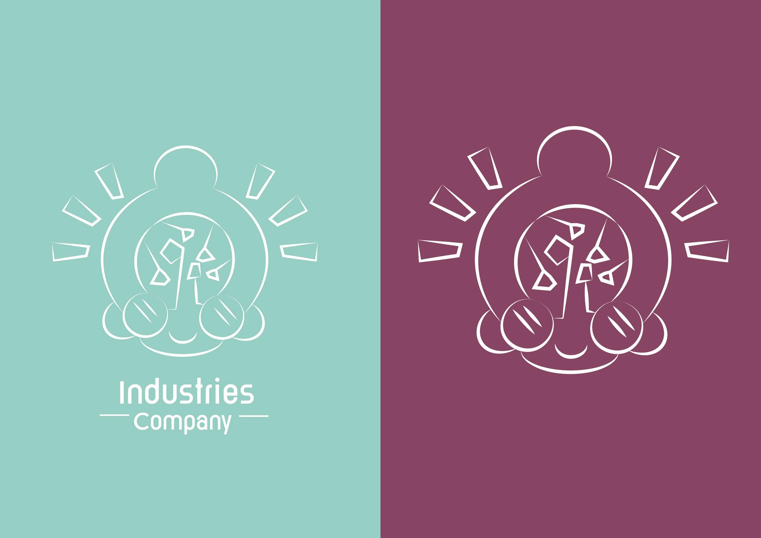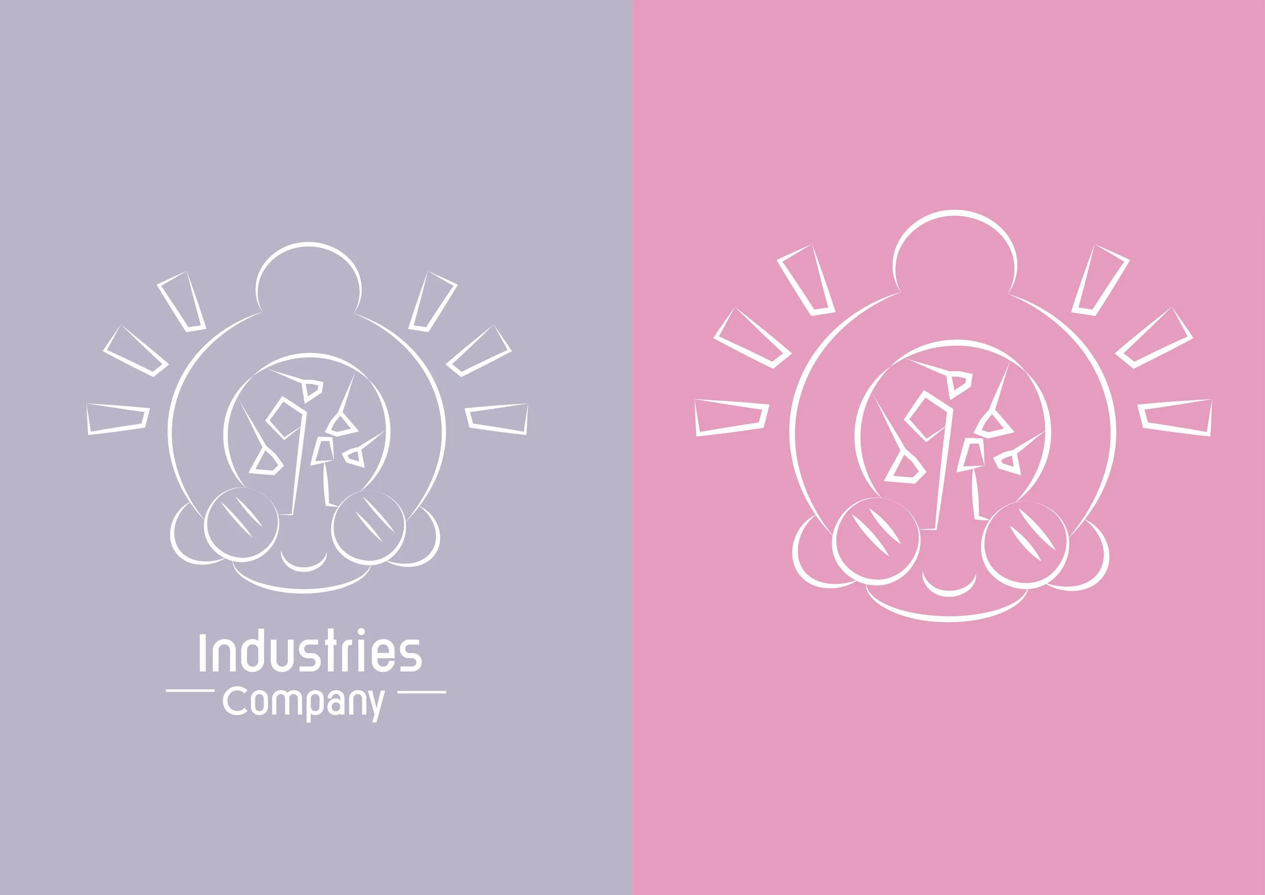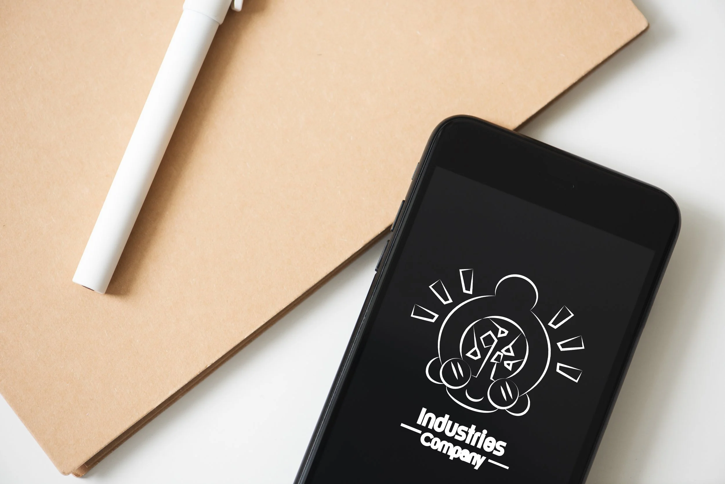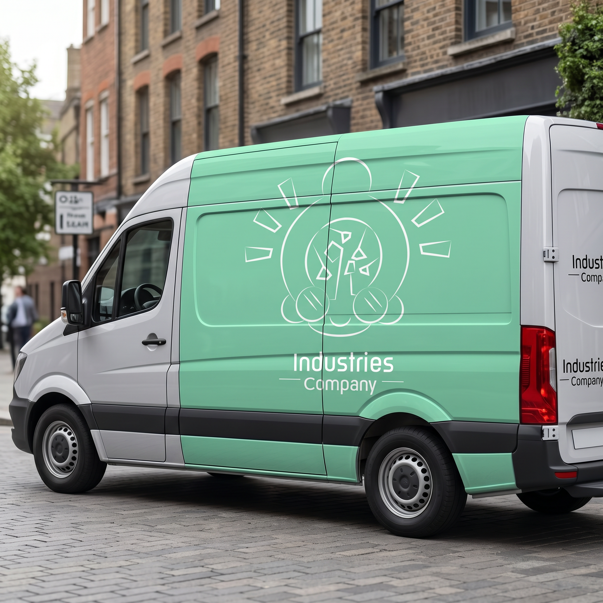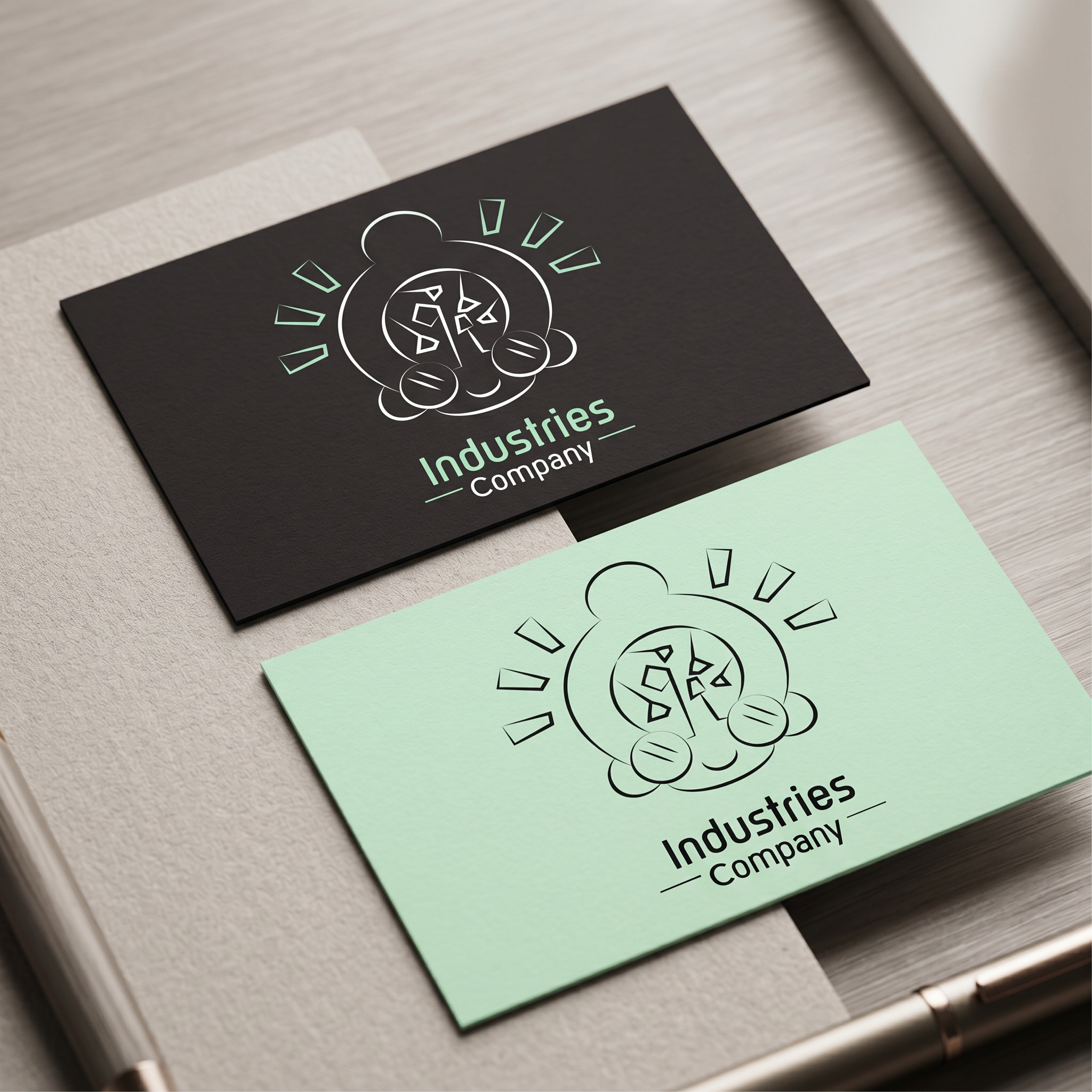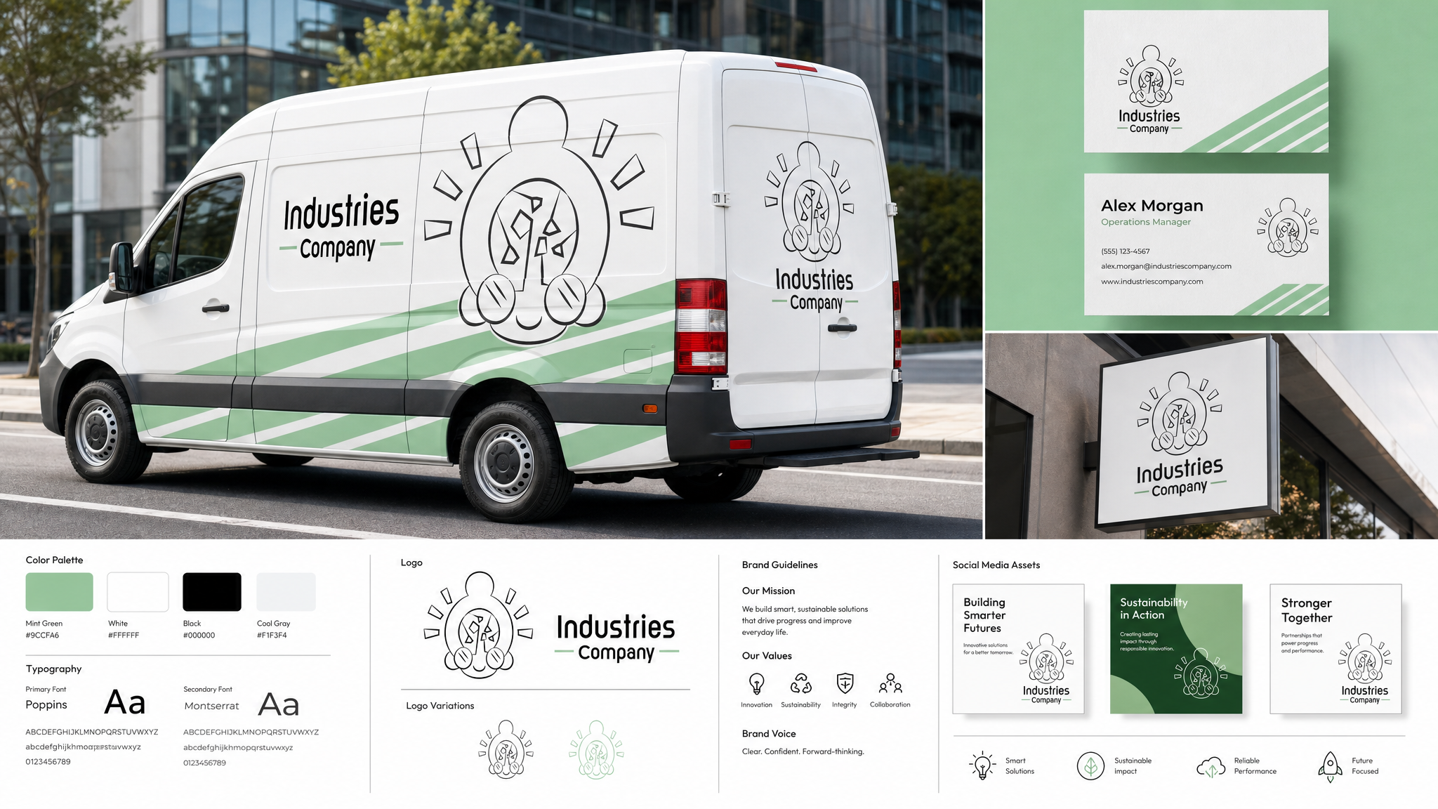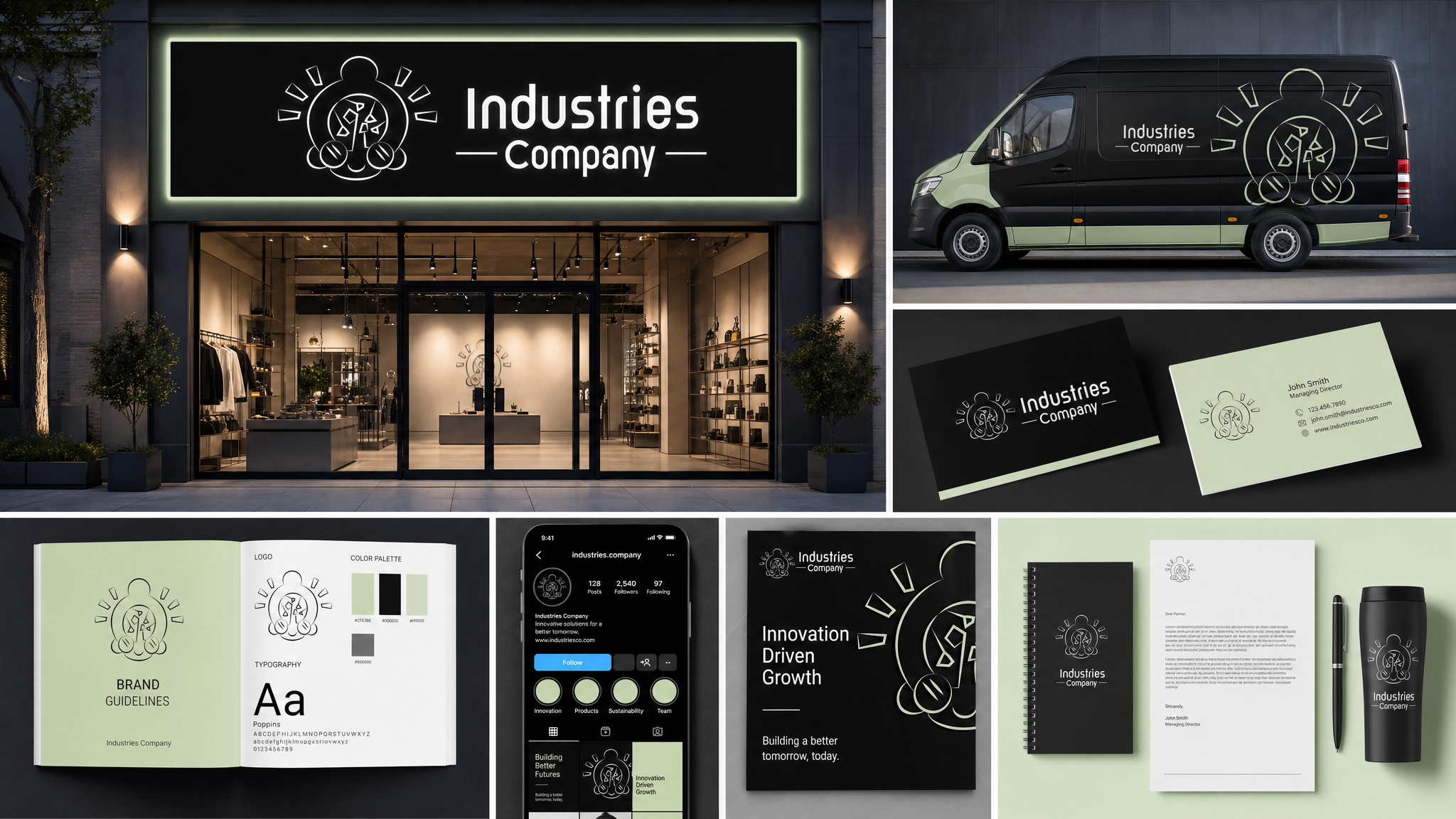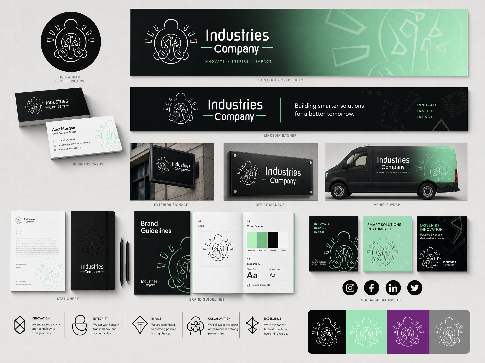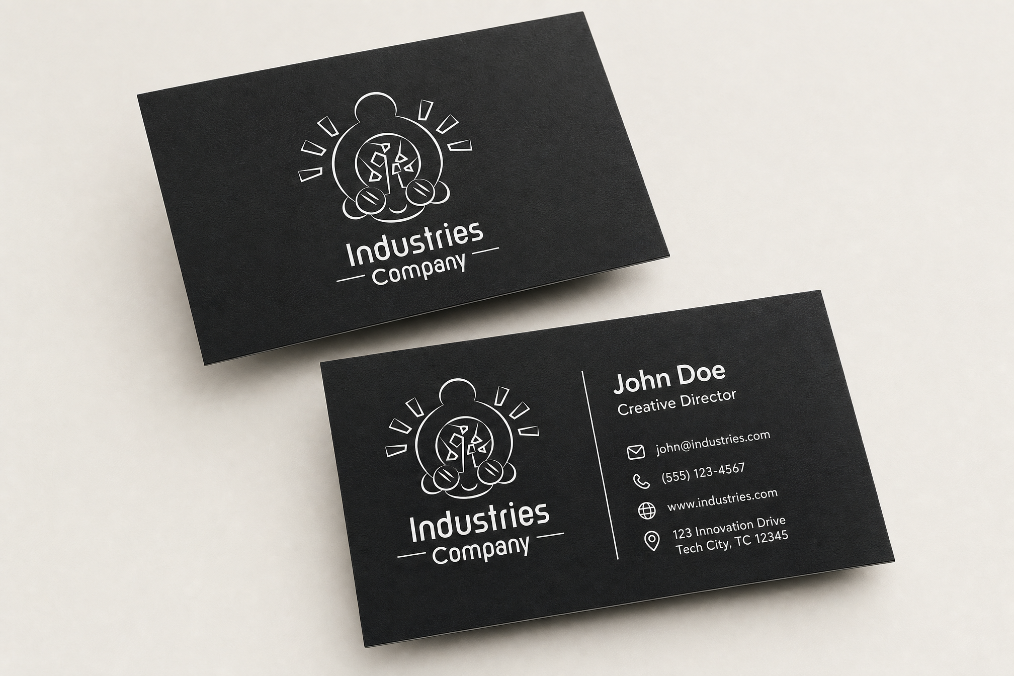

It all begins with an idea. Designing the identity for Industries became an exploration of wonder through simplicity. The brief called for an abstract white logo that could live confidently on moving vehicles while still feeling approachable to a senior audience. Inspired by the company’s blend of innovative technology and human-centred discovery, the direction focused on creating a mark that feels both futuristic and familiar.
The challenge was balancing realism with imagination — avoiding overly technical visuals while still communicating scientific progress and mobility. Through minimal forms and clean geometry, the final concept aims to reflect curiosity, movement, and trust. The use of white strengthens visibility and versatility across applications, giving the identity a calm, modern presence that feels timeless rather than trend-driven.